Elisa Design
System
Client
Elisa
Year
2021
Role
UX, UI, and Visual Design

Elisa is a Finnish market leader in telecommunications and digital services. They offer digital services also for international markets.
The Objective
Elisa employs several design-driven teams working on a variety of digital products. I was invited to work as a lead designer in the Design System team. We had just finished the brand sharpening work I was contributing to and the component library was under renewal.
Working closely with other designers my responsibility was to ensure the quality of the design assets and guidelines. On top of updating the design system, it was time to challenge some existing design processes.

System icons
In addition to the visual designs, we needed clear guidelines on when and how to use the icons. We also streamlined the process of adding new ones to the system.
The visual style is based on the Streamline icons. However, to make everything work seamlessly between three supported weights (light, regular, and filled), all the icons were redrawn to make it work.
Illustrative Icons
The old-style was redesigned to match the new visual style and colors. We created design templates and guidelines to ensure the correct use of the icons and consistency within the family.
While the system icons are being used mostly for common actions, Illustrative icons are representations of products, services, and specific features.
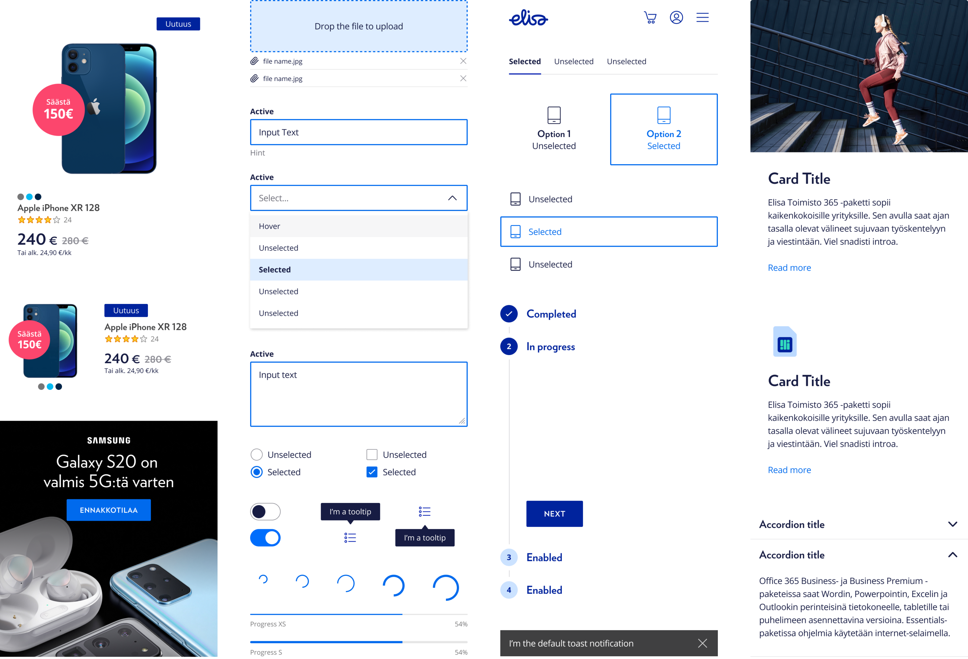
The Design System
With the existing workflow, one of the challenges was the lack of transparency. It was hard to find what other teams had done. There was no clear process on how files should be named and organized in the teams. Every team had its own way, even by designer. Another known pain was the need to sync big design files before even seeing anything.
Our first goal was to fix the challenges with the tools used. Instead of a combination of multiple design tools we choose to have only one, Figma. As a web-based app, all the designs were available for anyone without the need for a desktop app or Mac.
The new, updated component library was created and shared as a library. Also, other teams were able to share their service-specific components. To unify the design process, we created Figma ways of working guidelines to ensure consistency in file structure and naming.
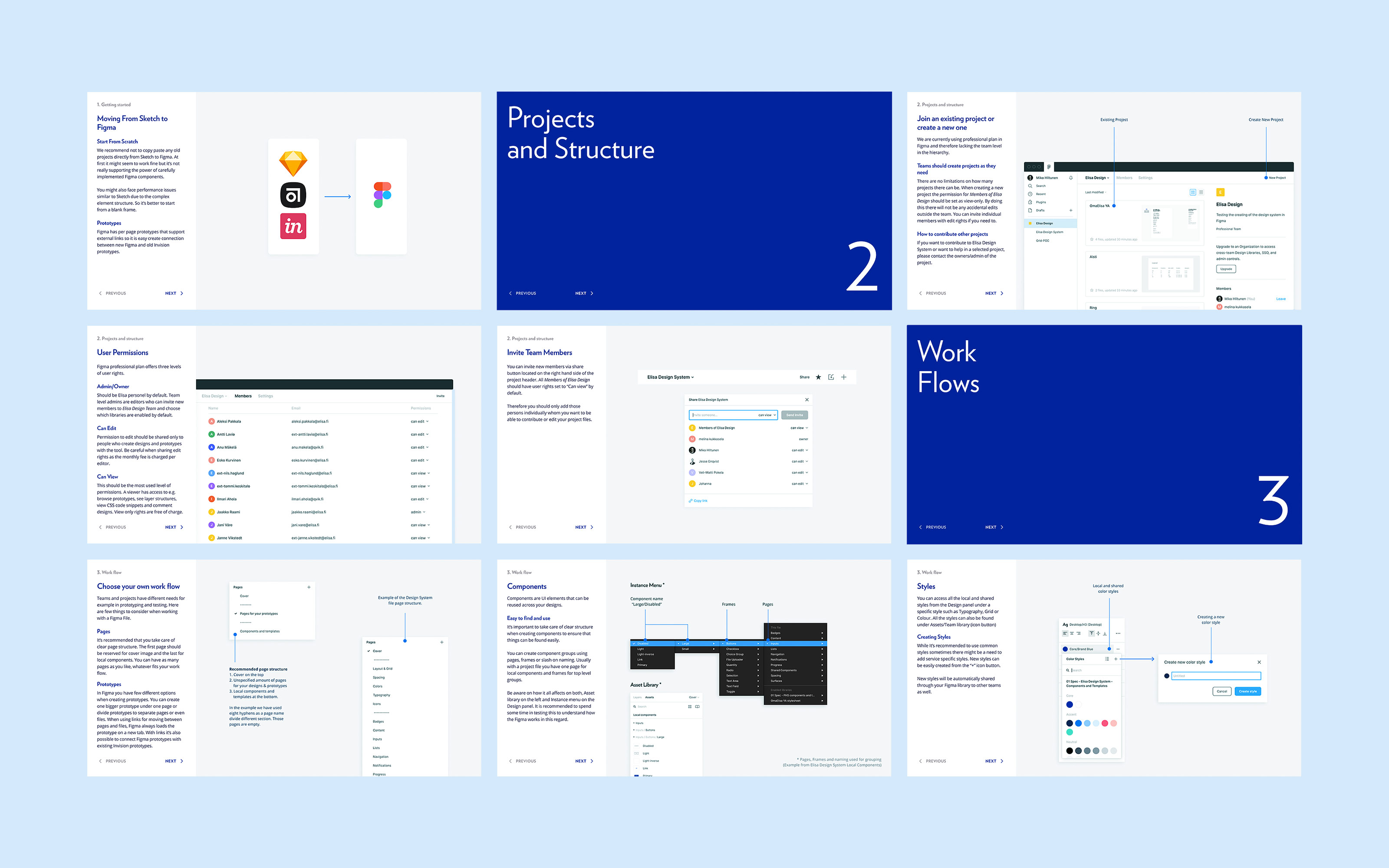
Figma ways of working guide.
Motion
Among the improved system for all components and styles, basic rules for the motion were defined. Instead of considering animation just as a fancy feature, it was important to underline the functional purpose of motion that can significantly improve user experience. The animation itself underlines natural, life-like movement. Duration is short and not time-consuming.
Living Styleguide
To be able to manage brand and digital products, it is crucial to provide up-to-date guidelines not only internally but to all external partners too. The old brand guidelines were outdated on a static PDF. We wanted to change this by making updated guidelines available for everyone online.
Now both, the brand guidelines and the design system for products live under the same domain. In the user-friendly web app, anyone with access can contribute to the system with ease.

Credits
Development
Pekka Ruuska
Varya Stepanova
Figma Process
Jesse Enqvist
Design
Mikko Häkkinen
Joris-Jan van den Boom