Realigning the
Visual Identity
Client
Solteq
Year
2019
Role
Visual Design, UI Design
Solteq is a Nordic IT service provider and software house specializing in digital business solutions and software markets.
The Objective
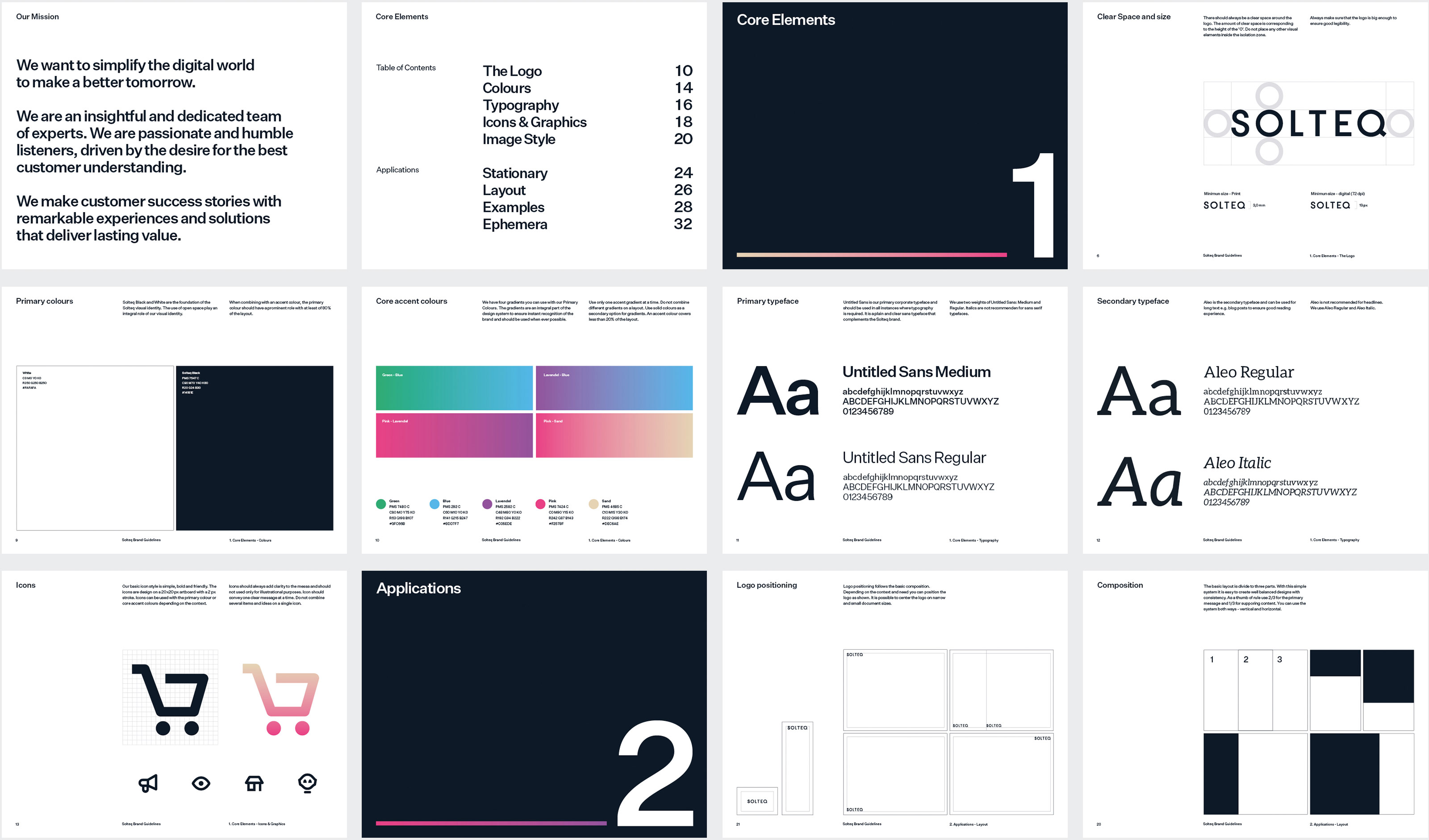
The existing design system was considered disconnected and outdated. There was a need to renew the visual identity to reflect the new mission “We want to simplify the digital world to make a better tomorrow.”
The Solution
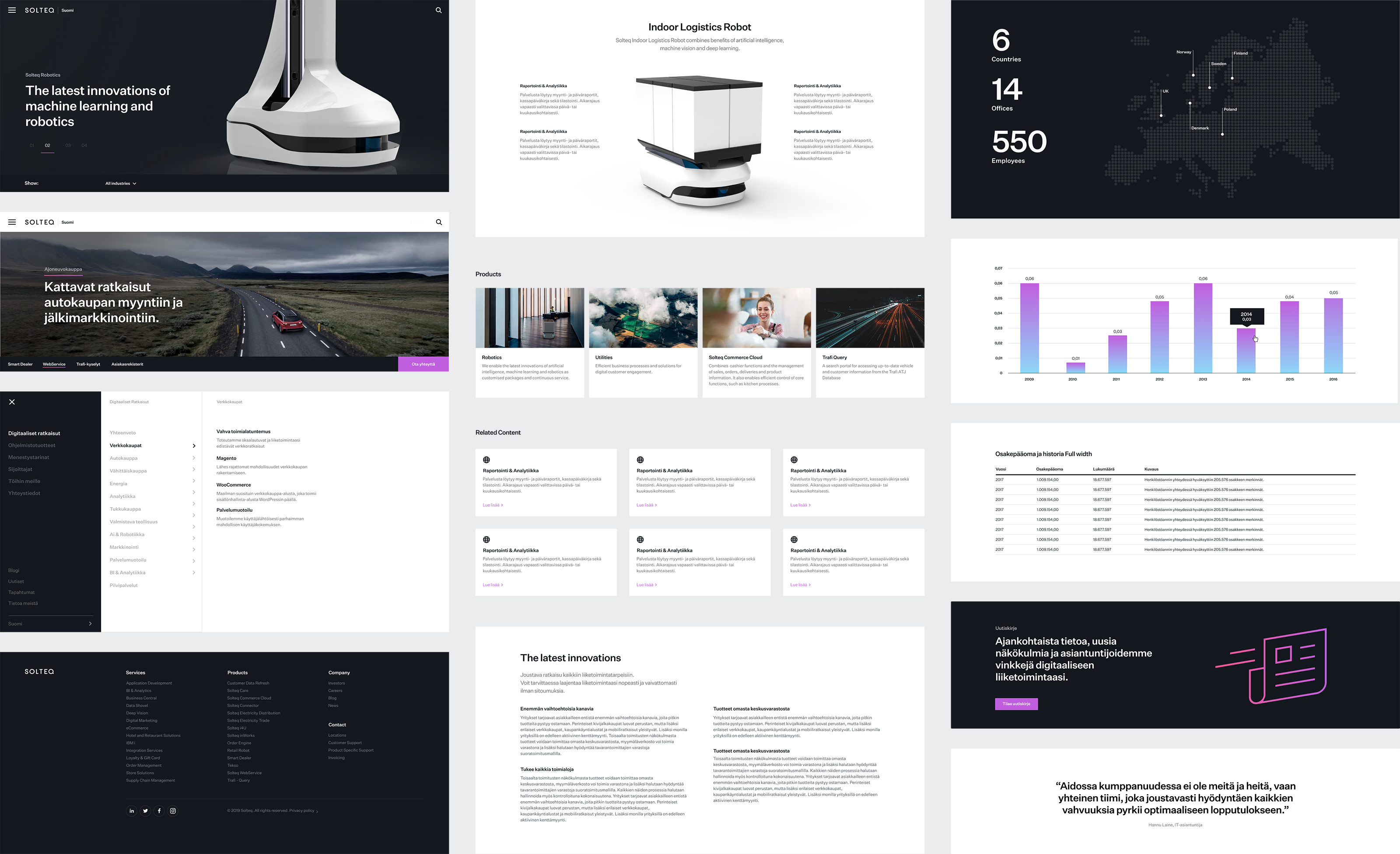
The goal was to simplify the visual identity to follow the new mission. We also needed a system that was easy to understand and use by anyone in the company. The work started from the digital channels. Web site designs focused on a modular design, offering building blocks for easy and flexible content creation.
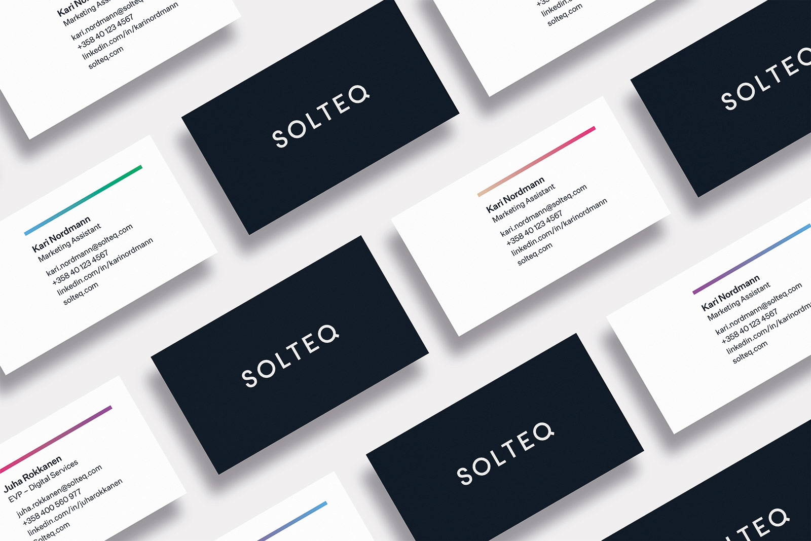
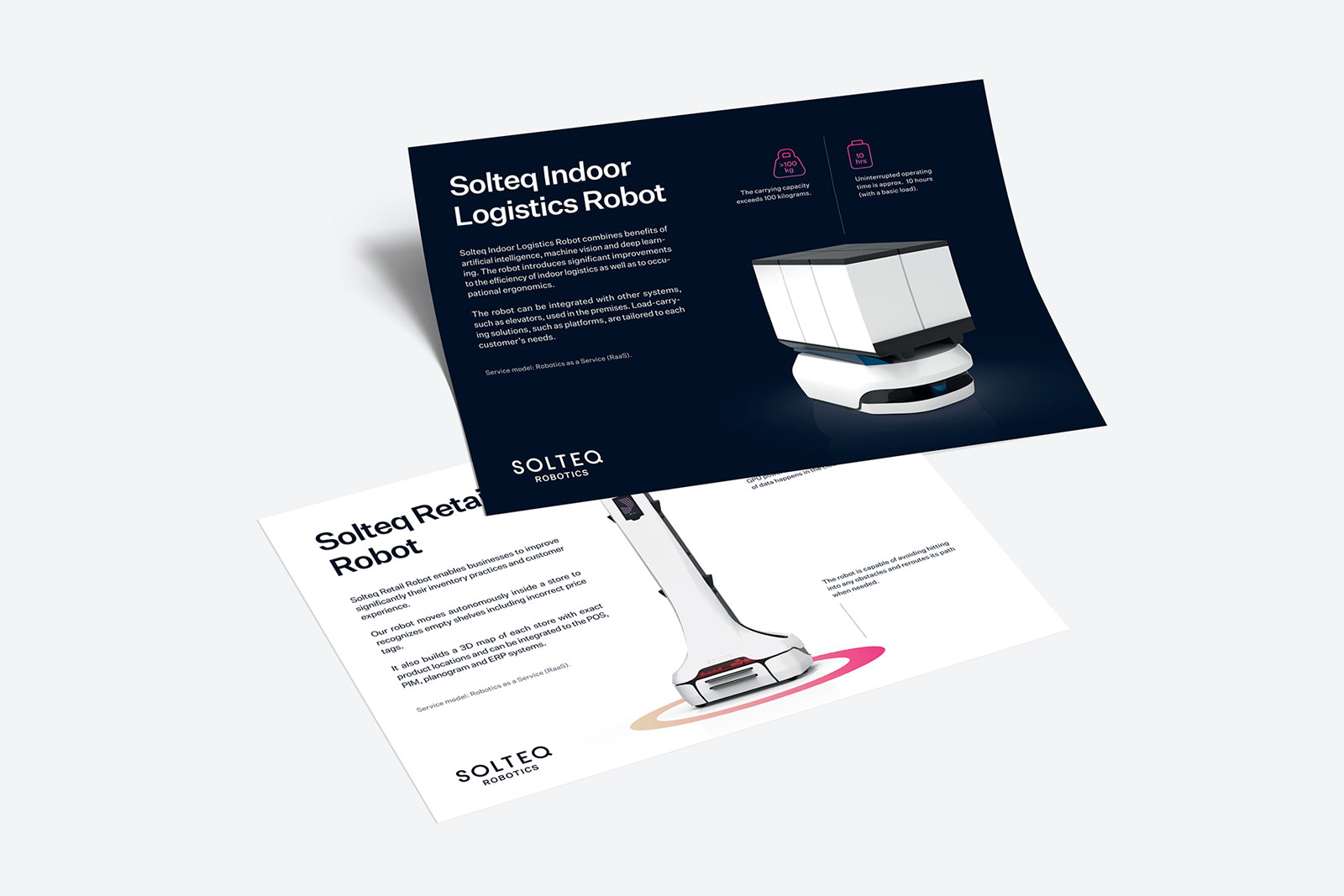
Vibrant gradient colors have been characteristic of Solteq's visual identity for years. In the new system, neutral white and black serve as a basis combined with sparingly used gradient spot colors for easy recognition. The generous use of white space combined with simplified and plain typography underlines simplicity.


The Team
Marketing Director
Matti Djateu
Marketing, Technology
Juha Pirinen
Development
Andreas Westerlund